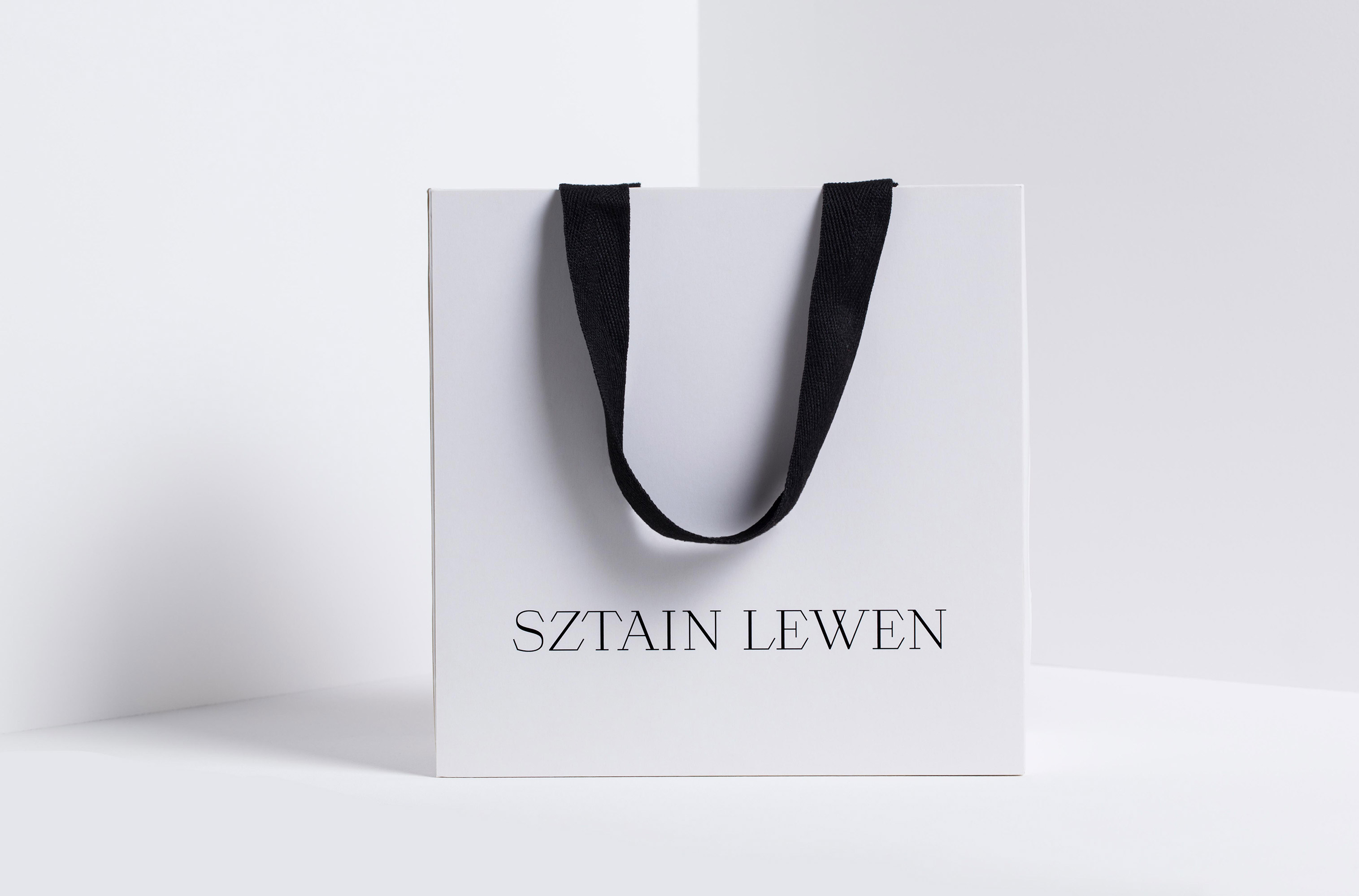
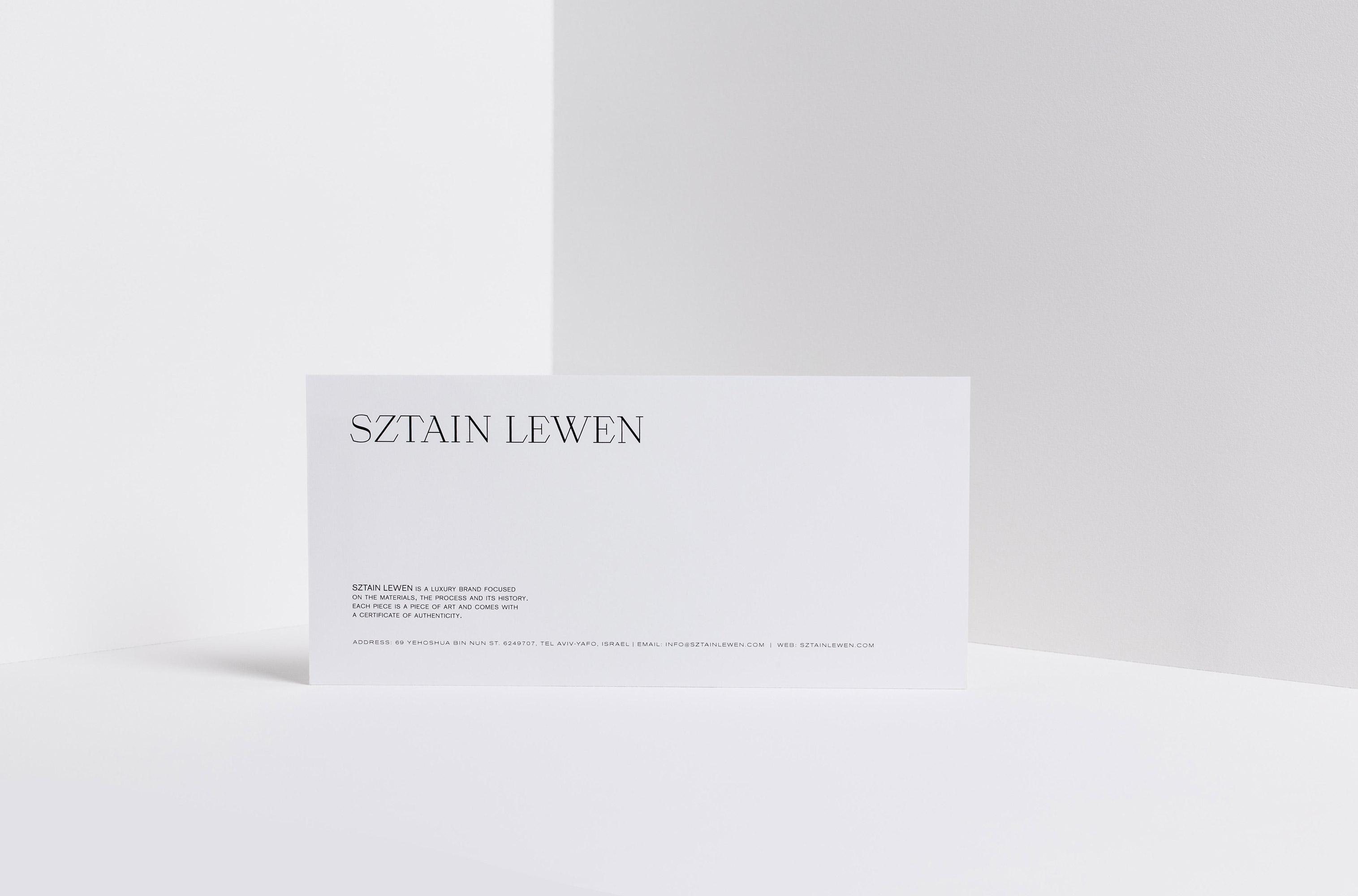
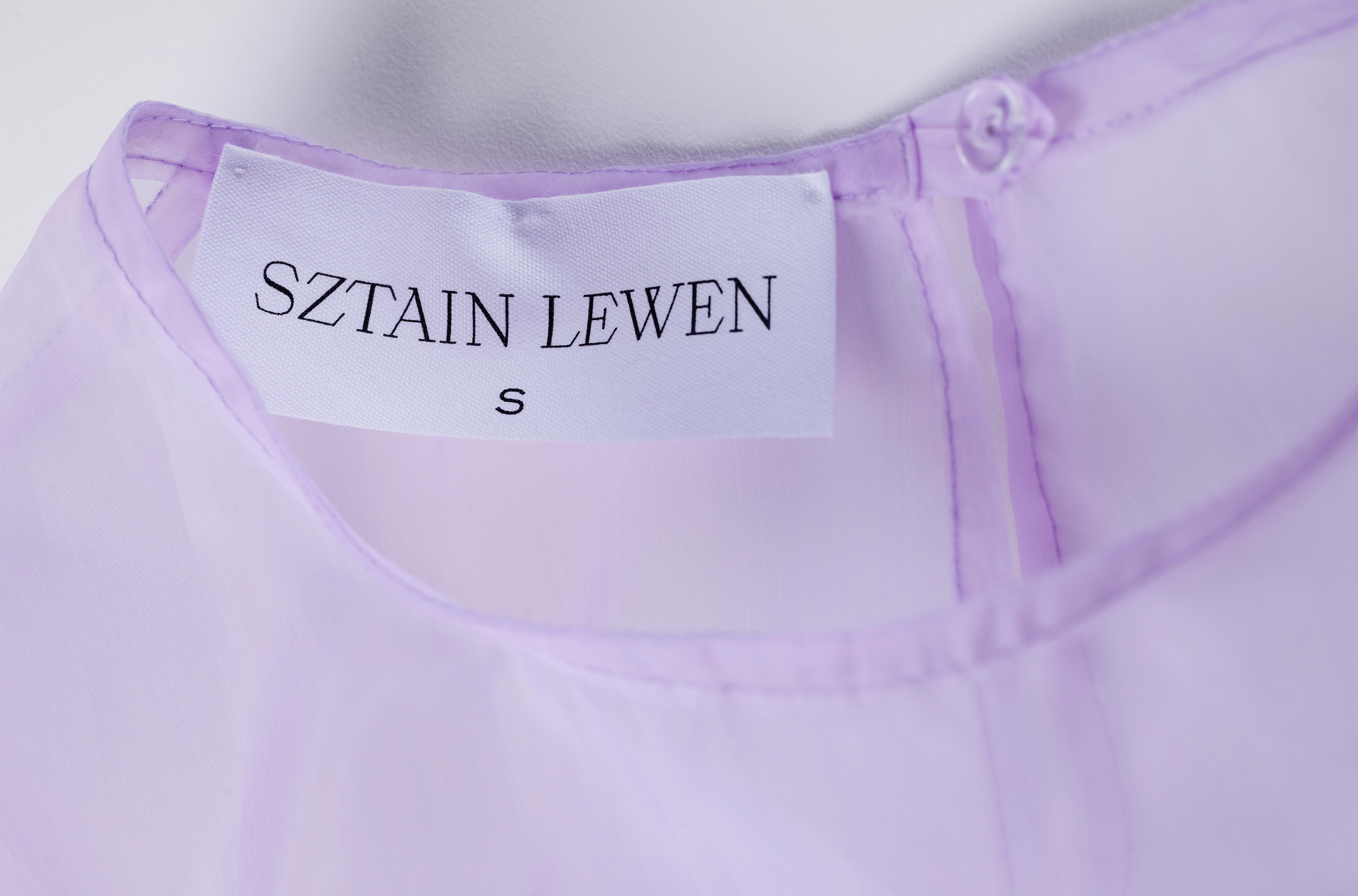
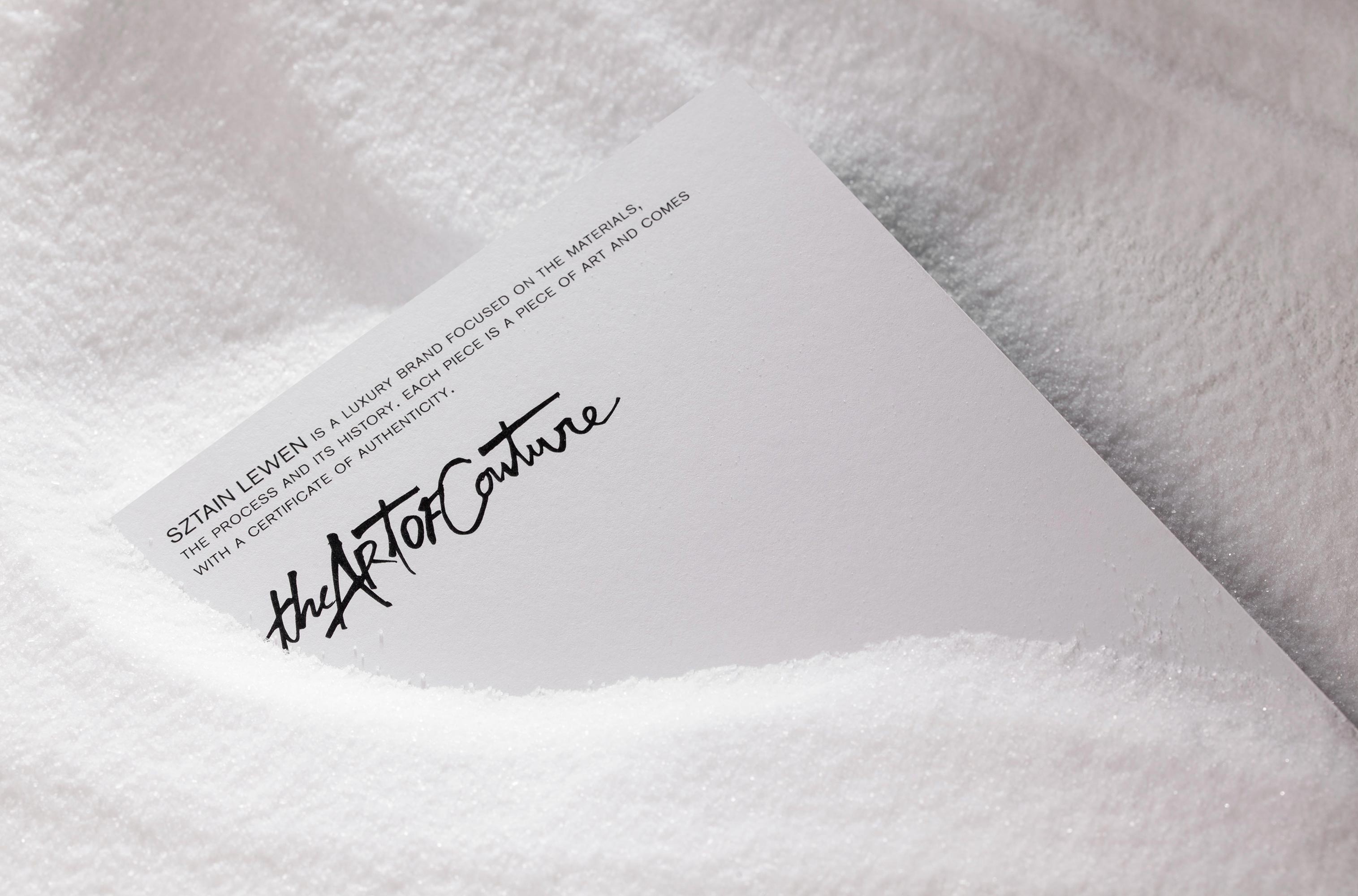
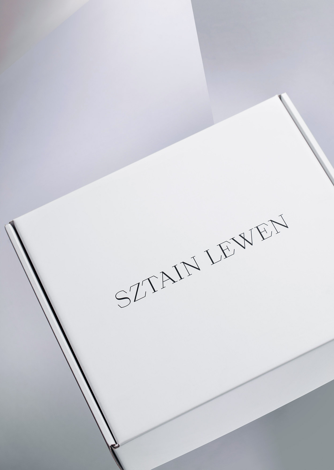
Sztain Lewen is a luxury fashion brand focused on the materials, the creation process and its history. Each piece is a piece of art and comes with a certificate of authenticity. We chose “The Present is Female” as the main message for the brand.
INSPIRATION
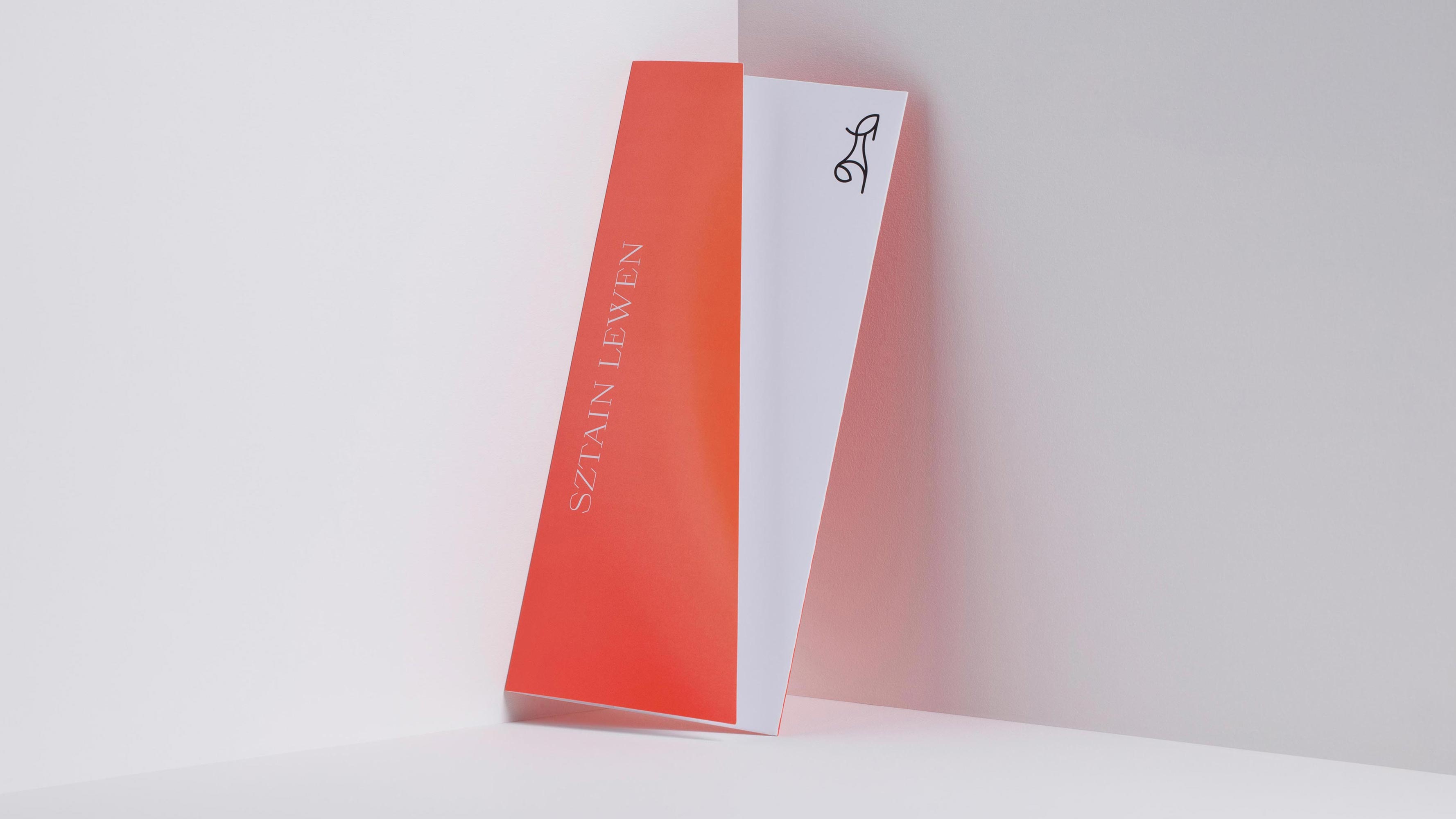
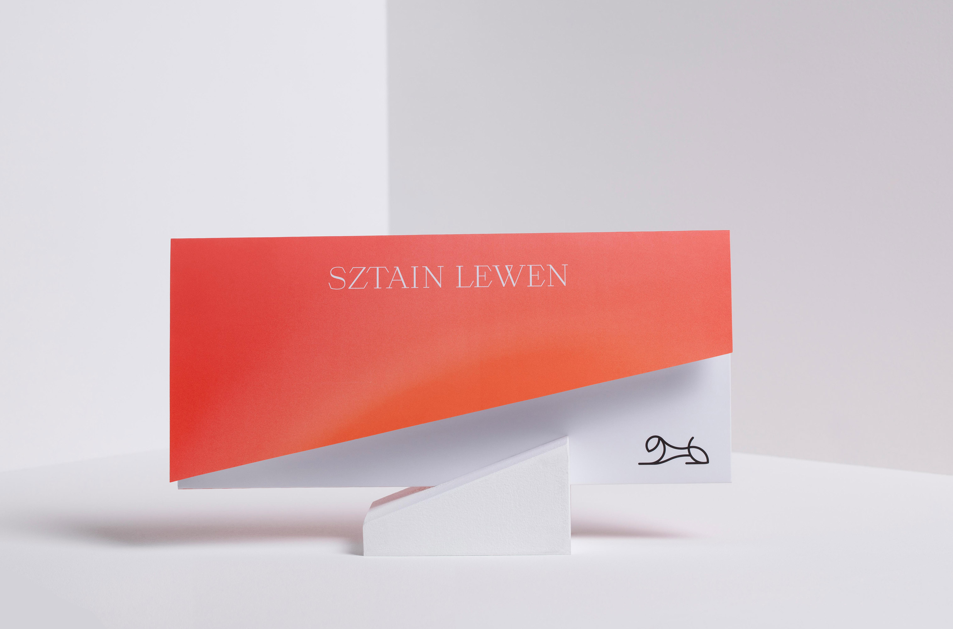
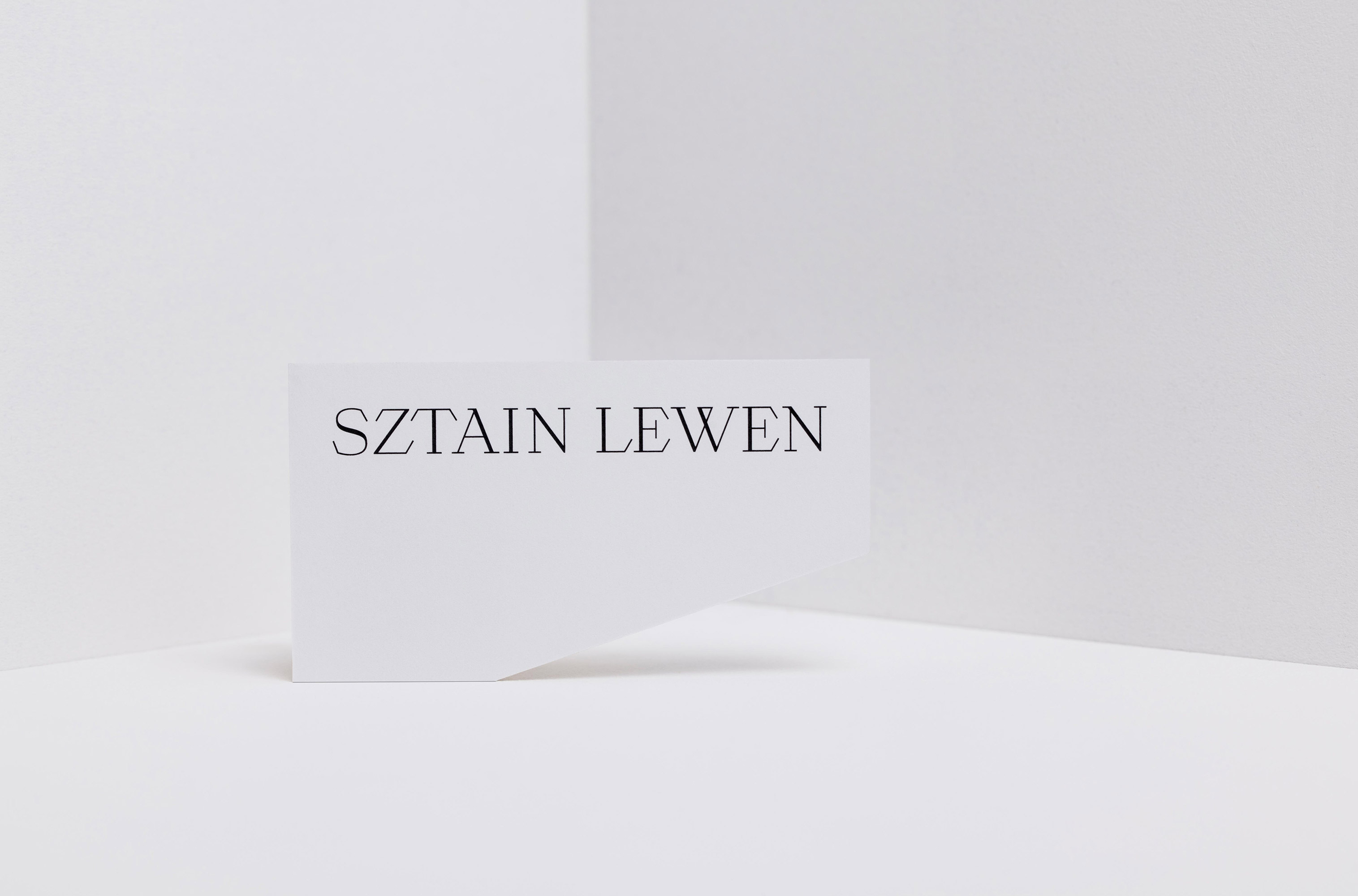
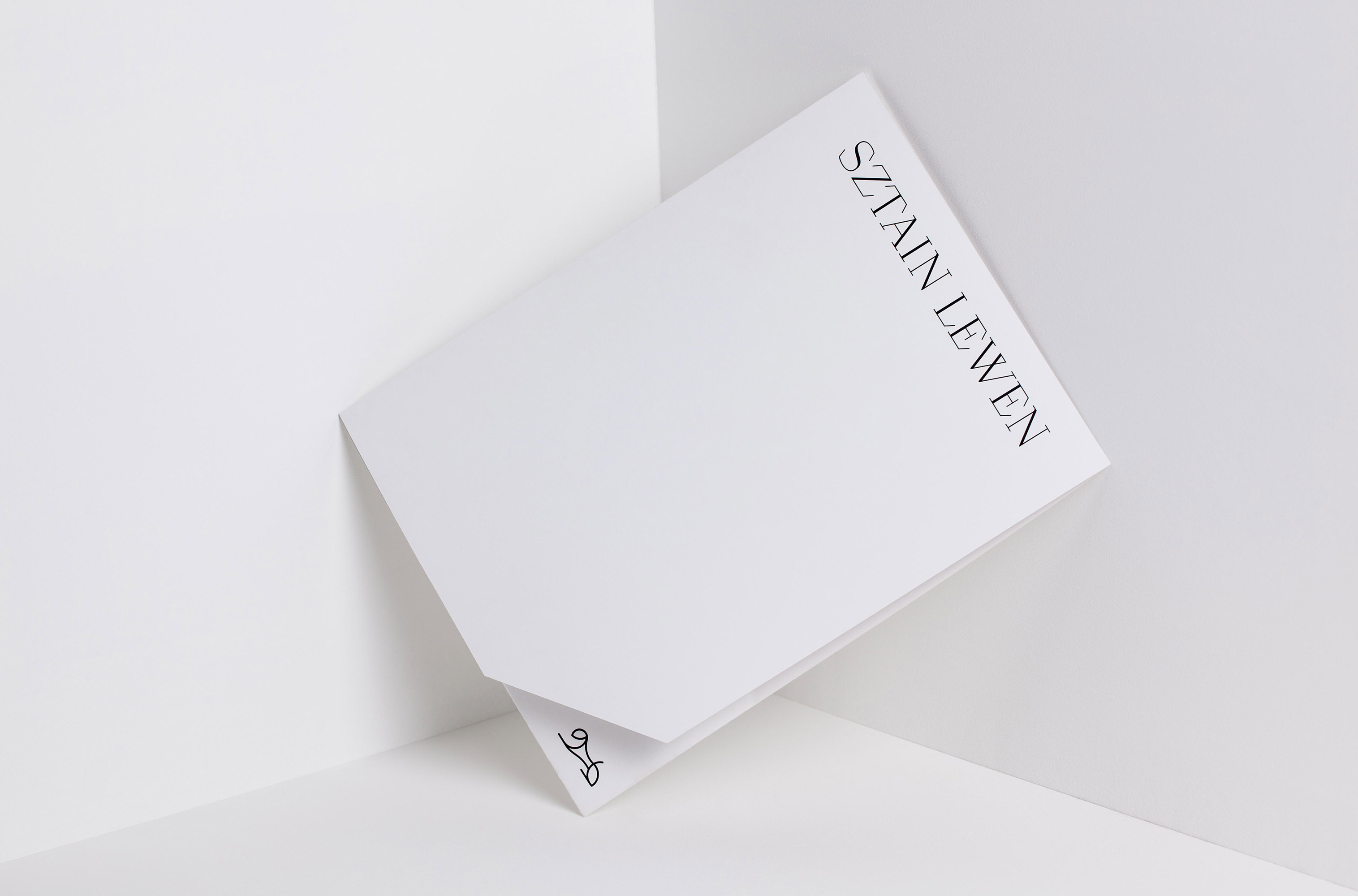
The brand was created following the values of uniqueness, self-expression and women power. The collection’s geometric shapes inspired us in the creation of similar diagonals on the branding itself. The name Sztain Lewen entails a family heritage we wanted to be shared: ‘Sztain’ means stone and ‘Lewen’ a lioness. The design sought to express it through the materiality, the visual language, the brand mark, the colours and its messages.
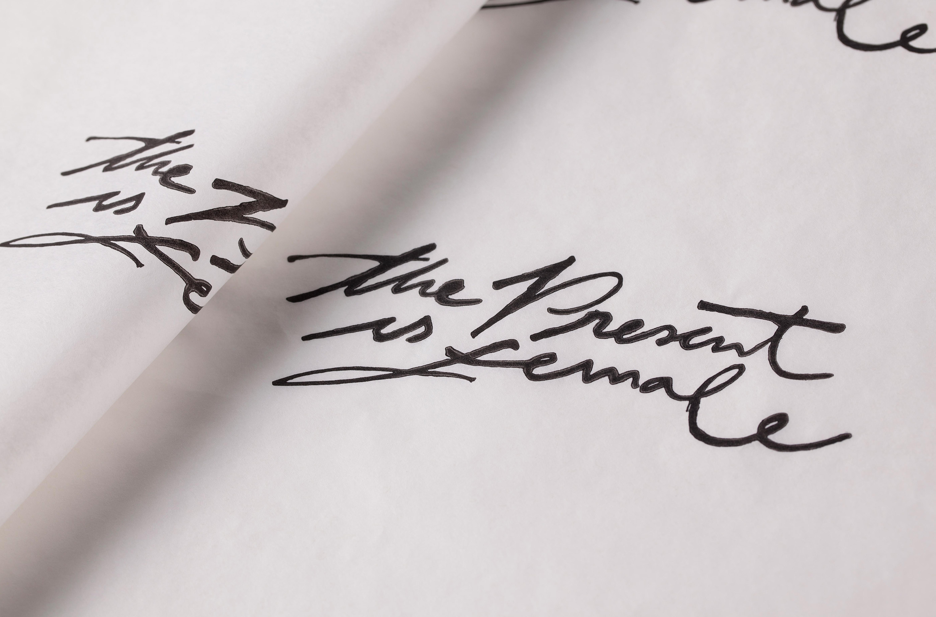
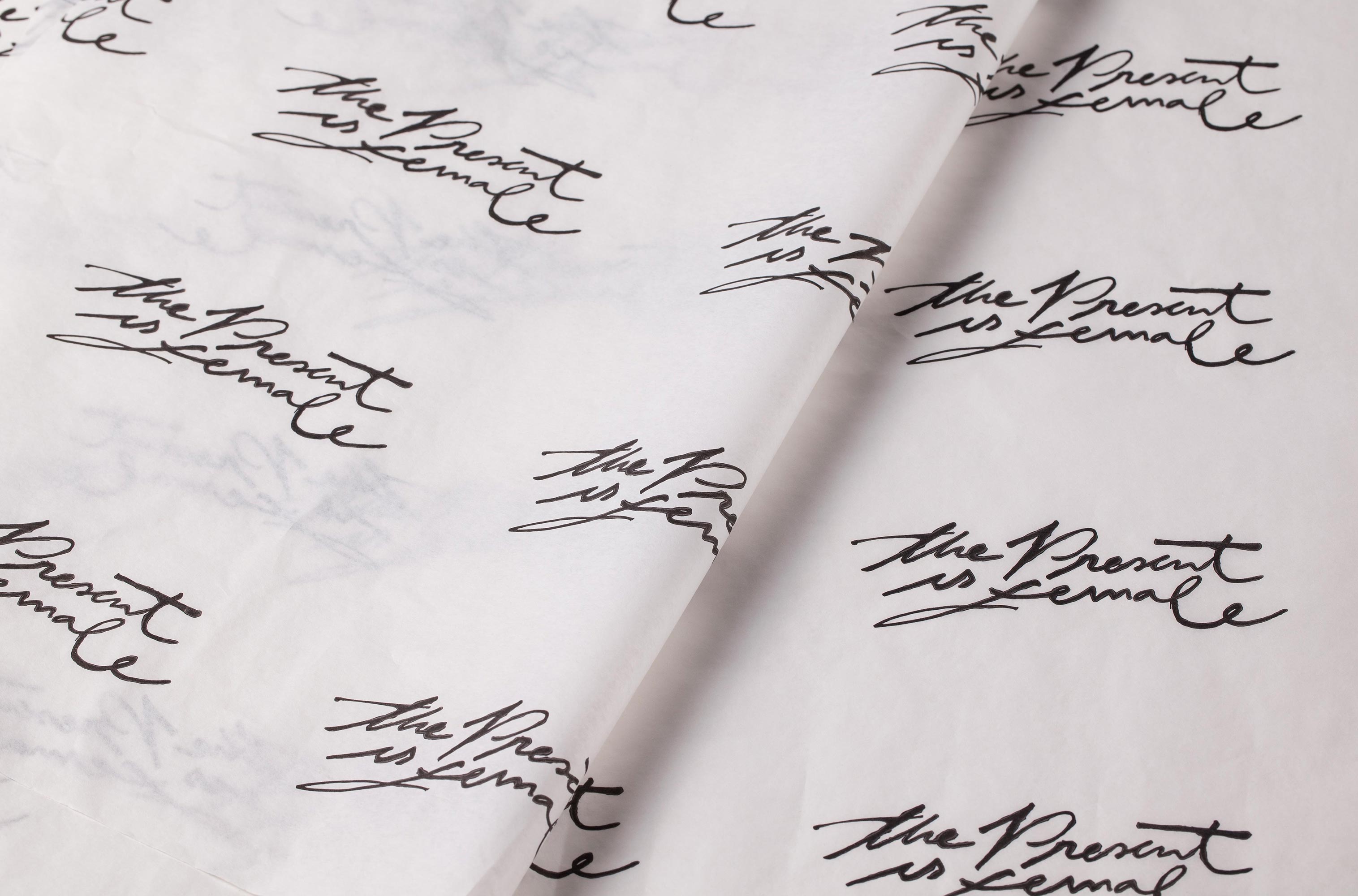
CALLIGRAPHY & COLOURS
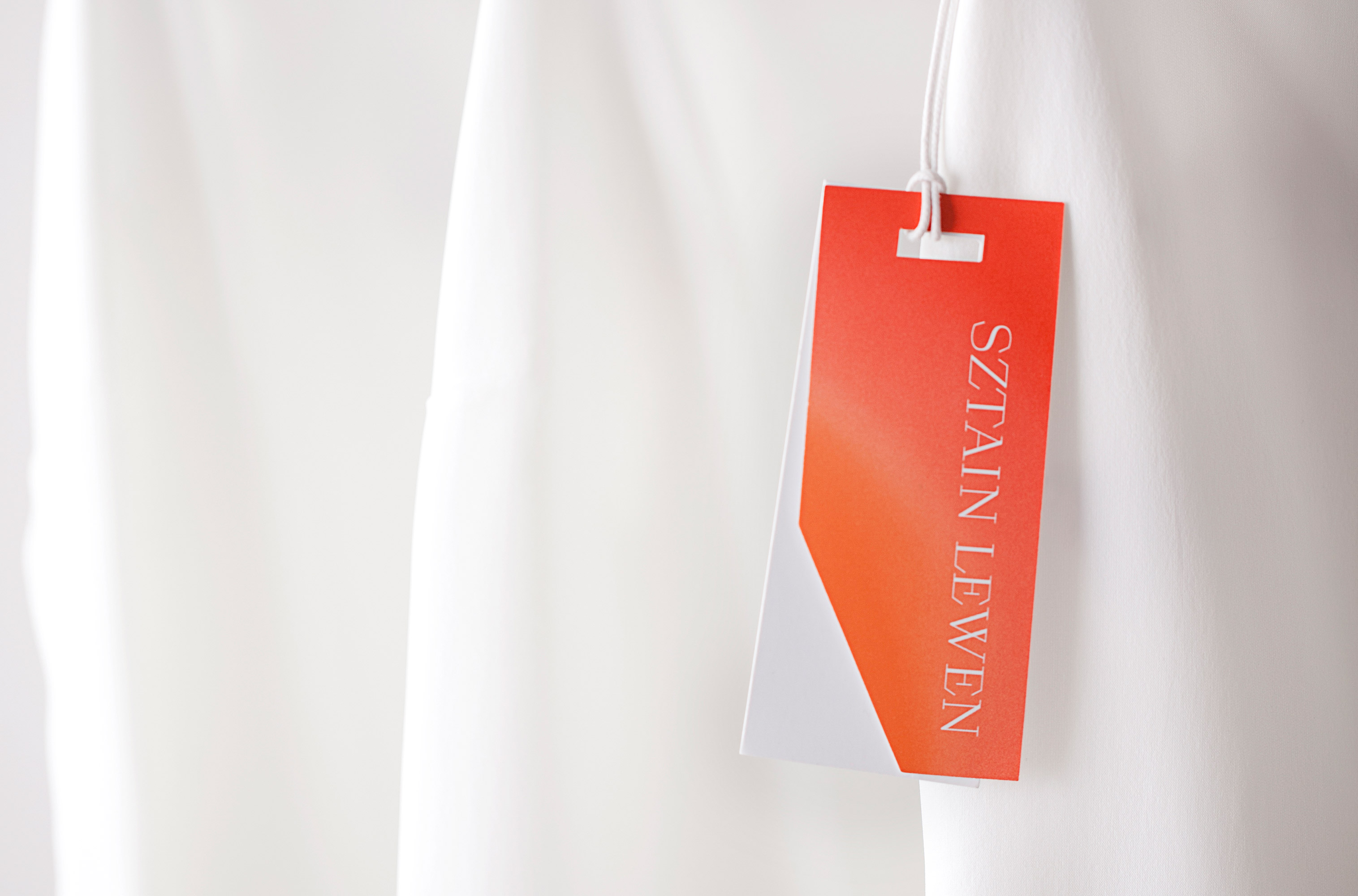
We decided together with the client, Shiri Schreiber, to integrate a very strong colour that will lead the Sztain Lewen brand identity. The decision wasn’t easy, since the tone we set was very black and white, but once we delved into the research process, we explored many different colour palettes. We ended up with a very passionate pink with a touch of orange to represent the new woman of 2020: Sophisticated and bold. We created a custom made calligraphy, made by Gastón Lisak, for each collection to reflect a human touch and encourage self expression.
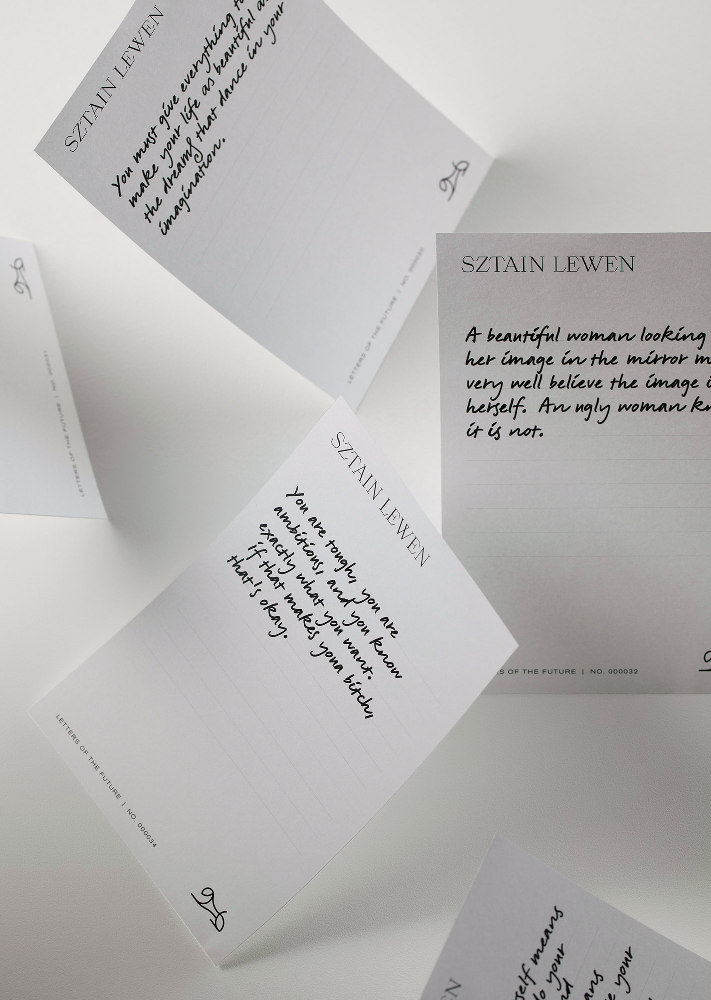
LETTERS OF THE FUTURE | THE FUTURE IS FEMALE
We created the letters of the future as part of the brand story to empower the Sztain Lewen women community through letters that they will write to each other and spread with the Sztain Lewen Collection in the shipping. Each letter will be received by a woman who doesn’t know the woman who wrote it for her.
Gastón Lisak (Calligraphy)
Oriol Miró Genovart (Logotype)
Hagar Erez, Gal Brin (Design Team)
Ran Golani (Brand Photography)
Guy Kushi & Yariv Fein (Campaign Photography)