Branding & Visual Direction

At Ark Visual, we create new brand experiences, working with specialized, tailor-made teams to meet each of our clients’ unique needs. We collaborate with a network of international creators from various disciplines, bringing together photographers, architects, multidisciplinary makers, strategists, programmers, UX designers, craftspeople and artists of all mediums.

image
Client: ToTo Restaurant, Yaron Shalev
Services: Art DirectionBrandingLogotypePackagingSignageUI UX DesignVisual Language

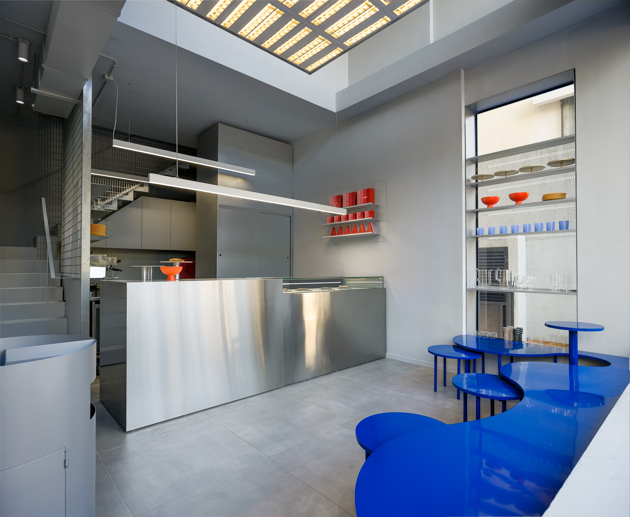
A rebranding for Toto Restaurant owned by Chef Yaron Shalev. The 500 sqm restaurant and cafe are located in the Museum Tower, next to the Tel-Aviv Museum of Art. The interior was designed by Studio Mu, a local firm which enriched the restaurant with modern inspired items and furnishings. The ToTo cuisine combines the best from the past and the finest from today’s culture. The talented Shalev has been considered a brilliant influence to the Israeli culinary scene.

Project Credits:
Research & Strategy Hagar Erez, Gaston Lisak
Branding & Creative Direction Hagar Erez
Typeface — Collaboration Hagar Erez, Bogidar Mascarenas
Cafe Design Team Hagar Erez, Gaya Kesten
Brand Photography Ran Golani
Interior Design Studio Mu

ToTo Restaurant

image
Client: Oberson Architects
Services: Art DirectionBrandingLogotypeMotion DesignSignageSocial MediaStrategyUI UX DesignVisual Language

We are excited to unveil Oberson Architects’ rebranding and UX UI. Dana Oberson and Oded Livyatan became more than just work partners, but sources of inspiration for us. We began our work process with a research workshop and strategy to get to know our partners and to develop an identity that represents them. With its clean and modern lines, the logotype reflects the firm’s commitment to the highest design standards. Our brand identity and UX UI are designed to convey an eternal expression of Oberson’s core values: design matters, eclectic, dialogue, professionalism. Oberson is committed to excellence in design, combining an eclectic aesthetic with a diverse set of materials that blend harmoniously.

Project Credits:
Research & Strategy Hagar Erez, Gaston Lisak
Design & Art Direction Hagar Erez
Team Hagar Erez, Masha Bystrova, Yotam Geller
3D Michael Pick
Motion Tal Uliel

Oberson Architects

image
Client: Alon Shabo Store
Services: Art DirectionBrandingLogotypePackagingSignageSymbol DesignVisual Language
Project Credits:
Brand identity & Design Hagar Erez
Design Team Hagar Erez, Gal Brin
Photographer Dan Perez

4 Shades of pink!

image
Client: Arkhe by Karen Oberson and Orit Razili
Services: Art DirectionBrandingLogotypeNaming & StrategyPackagingVisual Language

At ARKHÉ’s core is a meticulous curatorial concept that shines a light on Israeli multidisciplinary art. In the midst of an industrial product avalanche ‘ARKHÉ’ is about that point of difference. Handmade – crafted with care, attention and soul as opposed to mass produced and machine made. The brand seeks to rediscover the hidden ‘voice’ of the artisan who crafted the object with fine material using traditional fabrication techniques. The objects resonate the ethics and aesthetics of ARKHÉ, allowing to reestablish the lost connection between user and maker. The brand aims to touch the lives of those who appreciate unique and personal handicraft, and aspires to imprint it’s aesthetic vision in fields close to their heart. ARKHÉ founders Razili and Oberson connected on the basis of their shared passion for design and Israeli creativity. Their lifelong experiences together with the promising artists represented by the brand give rise to a new and unique language. It is what lets ARKHÉ lead Israeli artists and artisans in diverse disciplines such as ceramics, metalworking, woodworking, Jewelry, weaving and knitting, silkscreen printing and more. 

Project Credits:
Hagar Erez, Gaston Lisak Naming, Research & Strategy
Hagar Erez Brand identity & Design
Roni Cnaani, Ran Golani Photographer

Arkhe by Karen Oberson & Orit Razili

image
Client: COCO by Chocolatier Keren Tal
Services: Art DirectionBrandingLogotypePackagingSymbol DesignVisual Language

COCO’s founder, Keren Tal, challenged us to create a brand identity using only black, in order to achieve a radical contrast between the exterior and interior of her premium pralines. This unique challenge allowed us to create a sophisticated brand that reflects Keren’s attention to detail and passion for excellence. The use of black creates a sense of depth and luxury, resulting in a unique and striking brand experience that sets COCO apart from other chocolatiers. Keren’s clear vision and commitment to quality are evident in every aspect of the COCO brand, from the sleek packaging to the genuine and complete pralines inside.

Project Credits:
Hagar Erez Design Team
Sivan Rosihanu Brand Photographer
Hagar Erez, Yotam Geller Art Direction

COCO by Chocolatier Keren Tal

image
Client: Guerlain, Waldorf Astoria Hotel, Jerusalem
Services: Signage

Guerlain, a french house of fragrance, makeup and skincare house established in 1828, offers a new kind of spa: the Guerlain Spa & Wellness, a beauty lifestyle spa with a strong emphasis on its high-end retail spaces, embodying an essential aspect of a holistic guest experience. Its concept is built on the values of beauty, well-being, responsibility, and authentic personalised services utilising cutting-edge technology. We designed the signage system for the Spa & Wellness area using brass, expressing the brand values and in a fruitful dialogue with the interior design, planned by Keren Offner in order to create a contemporary, yet timeless and luxurious design in the spiritual capital of the world.

Project Credits:
Art Director Hagar Erez
Design Team Hagar Erez, Gal Brin
Photographer Michael Shvadron
Photographer Amit Geron
Project Manager Maya Joffe

Waldorf Astoria Hotel Jerusalem

Client: The Streetvibe
Services: BrandingLogotypeSymbol DesignUI UX Design

The Streetvibe was founded in April 2018 by Asaf Liberfrund to share a visual and textual presentation of everything exciting, elegant and trendy in fashion, blogging and lifestyle around the world. The Streetvibe combines fine arts and atmosphere documentation of international fashion events, focusing on brands, people and the experience around them through a meticulous and precise selection of prominent issues of interest.

Project Credits:
Brand identity Hagar Erez
UI UX Hagar Erez
Brand Photography Asaf Liberfrund

The Streetvibe

image
Client: Alon Shabo
Services: BrandingLogotypePackagingSignageVisual Language

Alon Shabo’s brand identity is characterized by his commitment to innovation and creativity. He continually pushes the boundaries of traditional pastry-making by experimenting with new flavor combinations and techniques, creating desserts that are both delicious and visually stunning. The packaging and interior design are thoughtfully curated to craft a customer experience that leverages the visual impact of color and shape.

Project Credits:
Hagar Erez Brand identity & Design
Hagar Erez, Gal Brin Design Team
Tamar Kalif Enamel Pins
Ido Adan Photographer
Simon Barazin Architect

Alon Shabo Shenkin

image
Client: Plan B
Services: Art DirectionBrandingLogotypePackagingSignageUI UX DesignVisual Language

Plan B is a fashion brand that focuses on providing basic clothing for women. The brand is designed to be simple, urban and dynamic. Recognizing the increasing demands placed on individuals in their daily lives, Plan B was inspired by the design systems of daily planners to offer a sense of order and ease. With a focus on simplicity, the brand is designed to relieve the pressure of having to make countless fashion decisions in an already hectic routine.

Project Credits:
Hagar Erez, Gaston Lisak Creative language
Hagar Erez, Fèlix Hernàndez Molina Design Team
Michael Svedron Photography
Ronen Chen Client

Plan B by Ronen Chen

image
Client: Kika Braz Architects and Urban Planners
Services: Art DirectionBrandingLogotypeSymbol DesignUI UX DesignUncategorized

Kika Braz Architects and Urban Planners Ltd was established in Tel Aviv by Kika Braz Schwartz in 1989. The firm designs a diversified portfolio of projects including residential, commercial, office, mixed use, and extensive and comprehensive urban renewals.

Project Credits:
Brand Identity & Design Hagar Erez
Photographer Ran Golani
UX UI Hagar Erez
Design Team Hagar Erez, Gal Brin, Gaston Lisak, Gaya Kesten

Kika Braz Architects & Urban Planners

image
Client: Elmina Hotel
Services: Art DirectionBrandingLogotypeNaming & StrategySignageSymbol DesignVisual Language

A brand identity for Jaffa’s new luxury boutique hotel, Elmina Hotel. The 10-room bolthole is located in the lively Jaffa Flea Market, close to the Mediterranean Sea. Named after the Arabic word for “port”, Elmina (ميناء), is housed within an architecturally preserved Ottoman-Era building from the early 20th century. The interior was designed by Studio Michael Azoulay, a local firm which enriched the hotel with art-deco inspired items and furnishings. The hotel’s rooftop features a beautiful public sunset lounge and a bar designed by Ron Arad.

Project Credits:
Brand identity Ark Visual in collaboration with Dov Kroll
Brand Photography Ran Golani
Hotel Photography Sivan Askayo
Interior Design Studio Michael Azoulay
Rooftop Design Ron Arad Architects

Elmina Hotel

image
Client: Non-commercial
Services: Art DirectionIllustrationNaming & Strategy

The naming is based on the bouba/kiki effect which is a non-arbitrary mapping between speech sounds and the visual shape of objects. During a social experiment participants have identified the curvy as “bouba” and the jagged one as “kiki”, suggesting that the human brain somehow attaches abstract meanings to shapes and sounds in a consistent way. The branding we created for Kiki & Bouba is aimed to express Tel-Aviv in 2020, through curvy and jagged shapes, using architectural iconic buildings, such as Bauhaus, Dizengoff Square’s landmark Fire and Water Fountain by Yaacov Agam, and more. The idea behind it was to reflect the vibrant state of mind of the white city, using a very vivid language and base colours full of happiness.

Project Credits:
Design Team Hagar Erez, Gastón Lisak
Illustration Niv Tishbi

Kiki Bouba Sketches

Client: Non Commercial Project
Services: Art DirectionMotion DesignVisual Language

Dani Wolf and Hagar Erez decided to play a game during quarantine: usually, a game consists of rules and winners. This experimental game has however no winners, only the aim of creating unpredictable outcomes! Wolf and Erez, both designers, have an unexplained appetite for typography and composition, so they came up with the idea to play a game based on the text-based “Pass the Story” original game. The goal is to create visuals and to express feelings and the joyfulness of creation by using less words, resulting in a genuine visual story concept.

Project Credits:
Concept & Design Hagar Erez in Collaboration with Dani Wolf

Pass Post: Visual Relief

image
Client: Neta Winery
Services: BrandingIllustrationLogotypePackagingSymbol Design

Neta is a young winery offering innovative and fresh blends. The founding generation of the Bravdo Winery stands behind the brand with its 140 years of rich experience in viticulture on the family estate. The visual language we created reflects the hybrid of the old and new wine philosophies. The illustration of the children as captured by Ruth Gwily represents yet another generation of Bravdo’s “offspring” vineyard. The brand celebrates the family’s love of the land and is also reflected in the brand name, “Neta”, which originates from the Hebrew verb “to plant”. The label design particularly illustrates the brand story through the dialogue between the two “Red” and “White” bottles. On one you can see the girl watering and on the other, the seeds growing.

Project Credits:
Branding Ark Visual in collaboration with Dov Kroll
Naming Sharon Gesthalter
Illustration Ruth Gwily
Photography Uri Grun

Neta Winery

image
Client: Sztain Lewen
Services: BrandingLogotypePackagingSymbol DesignUI UX DesignVisual Language

Sztain Lewen is a luxury fashion brand focused on the materials, the creation process and its history. Each piece is a piece of art and comes with a certificate of authenticity. We chose “The Present is Female” as the main message for the brand.

Project Credits:
Branding & Strategy Hagar Erez, Gastón Lisak
Calligraphy Gastón Lisak
Logotype Oriol Miró Genovart
Design Team Hagar Erez, Gal Brin
Brand Photography Ran Golani
Campaign Photography Guy Kushi & Yariv Fein

Sztain Lewen

image
Client: Otello Gelato
Services: Art DirectionBrandingIllustrationLogotypePackagingSignageSymbol DesignVisual Language

Otello Gelato, 80% Ice Cream, 20% Chocolate is a fine ice cream brand with an Italian concept, which combines high quality chocolate products with a delicious artisanal ice cream. The design offers a new customer experience which hasn’t yet been seen in Tel-Aviv. Each store has a different interior design, based on the brand language. We created a handmade calligraphy logotype reflecting the traditional ice cream making methods and illustrated a symbol inspired by Otello Cattabriga, the inventor of the first automatic ice cream machine. The Otello branding reflects a timeless yet modern and warm voice. We’re happy to see the brand growing and expanding every day!

Project Credits:
Branding & Design Hagar Erez
Design Team Hagar Erez, Gal Brin
Interior Design Studio Opa
Brand Photography Ran Golani
Interior Photography Michael Shvadron

Otello Ramat Aviv

image
Client: Jiro Sushi by Japanika
Services: Art DirectionBrandingLogotypePackagingSignageSymbol DesignVisual Language

Jiro Sushi is a new brand, a sushi bar built on the emblematic ‘Japanika’ booth space at the corner of Rothschild Blvd and Allenby St., Tel-Aviv. The brand language is minimalistic and bold, of high quality yet very accessible. The design was inspired by the iconic Tel-Aviv International Style buildings. The deeper we found ourselves in the design process, the more we reduced the visual language, resulting in a black and white colour system, using typography as the central means to reflect simplicity and the Tel-Avivian urban state of mind.

Project Credits:
Brand identity & Strategy Hagar Erez
Design Team Hagar Erez, Gal Brin
Photography Ran Golani

Branding for Jiro Sushi by Japanika

SUBSCRIBE TO OUR NEWSLETTER:

Thank you
for signing
up!